How do you design a good homepage?
In order to create the best homepage you can, you have to understand that it’s a little bit “art” and and a little bit “science.”
And I’m covering all the steps you need to take and all the things you need to do to build one that’s awesome!
But first – there are a couple things we need to talk about.
So before we get started let’s lay some groundwork.
Your homepage plays a crucial role on your website.
It’s the page that has the best opportunity to rank high in search engine results because when someone links to your website it’s your homepage they will most likely link.
If you look at your analytics for your website you’ll see it’s probably the most visited page out of all the pages on your site.
So it should come as no surprise that best homepages ever designed are the result of lots of thought, research, and great planning.
But where do you begin?
When it comes to designing a new homepage for your website the best place to start is by figuring out your strategy and what you want to achieve before you start building anything.
Here’s the best part:
You don’t have to be a huge company with a big design and development team and big budget to create an awesome homepage!
Regardless of whether you’re a small business, online marketer, blogger, mom-and-pop shop, or something in between, you can create a great homepage for your site that will serve your audience and represent you well!
If you think through what you’re trying to accomplish and follow the principles we’re going to talk about here you can build a homepage that you will be proud of.
In this guide we’re going to cover planning, designing and building out the best homepage for your website. We’re going to talk about putting together a great plan that starts with defining your priorities, and figuring out who your target audience is. We’re going to cover how to put together the content on your homepage that speaks to your audience clearly, and we’re going over each section of the page and how to build it to deliver maximum impact.
To make navigating through this guide a little easier, here is a table of contents for what’s covered:
- How to define your priorities so you’re sure you’re building correctly
- How to define your target audience so you know who you’re talking to
- How to create killer content for your homepage
- How to use design to communicate your message
- What page sections you need to include and how to design them for maximum effectiveness and impact
You ready? Let’s jump in.
Define The Priorities For Your Homepage Design
One of the first things I talk about with clients when working on a design for their new site is priorities.
“What does success look like? What’s the first thing you want a visitor to do when they get to your homepage?”
When I ask this question with clients sometimes I get a look of confusion, as if they’d never thought of this before. It’s not uncommon to see situations where they never really defined success or had anyone walk them through a discussion of priorities when it comes to their homepage outside of what they want it to look like.
Here’s the bottom line:
To make your homepage a success you have to figure out what you want your visitors to do when they get there and define what success looks like.
Maybe it’s signing up for a trial of your service. Maybe it’s signing up for a demo. Perhaps it’s downloading a guide of some kind. Maybe it’s leading them to view your products or services.
Whatever the priorities are might be, it’s vital to define them. Without a clear picture of what your priorities are, and what success looks like, you can end up with a site that has a lot of nice features but really doesn’t accomplish much.
Know your audience
Knowing who your homepage is talking to is a key factor for success.
Here’s the deal:
The purpose of your homepage is to attract visitors, answer their questions and pain points, and encourage them to engage more deeply with your site while you demonstrate your capabilities, professionalism, and ability to deliver results.
According to Inc Magazine, you have roughly 5 seconds to capture a visitor’s attention with your headlines and visuals. To be effective in capturing their attention you need to know who they are, and what they want. You need to be able to communicate that you know and understand their problems and pain points.
To do this, the smart move is to create personas to define your ideal customers.
You might be wondering:
What are personas, exactly?
Personas are fictional characters who represent a specific set of traits and characteristics – what they do for a living, their age, where they live, what they like, what they don’t like, what they’re struggling with, and so much more. Buffer has a great resource on creating personas that I’d recommend checking out so you can really nail this part.
Personas help you learn about the real people who they represent. By building these personas you learn more about who these people really are, what makes them tick, and uncover the concerns and challenges real people in your target audience have.
Once you’ve got a clear picture of who these people are, and how your business can help them, you can answer their questions because you understand where their problems and pain points are, and you can map out how your products or services help them.
This is a huge point: One of the most important parts of the process of creating personas is figuring out what questions they have in regard to their struggles, and ultimately how you help them with those challenges.
Here’s the kicker:
You speak to them more directly and effectively when you know how to answer their questions. It empowers you to create your homepage in a language they can understand, that solves problems, and delivers results for them.
Makes sense, right?
If your homepage isn’t answering their questions effectively, you’re doing it wrong, and you will notice in your results.
By building your homepage with your target audience in view, you start to build a connection that helps them to know and trust you.
You’re able to speak to what’s holding them back.
You can address the obstacles they need to overcome.
You can show them what’s in store for them when it all comes together, and ultimately how you help them to get the solution they’ve been looking for.
How to Write Killer Content For Your Best Homepage
Once you’ve established your priorities and figured out who your target audience personas are, it’s time to start talking about content.
One of the things I’ve run in to over and over again in the years since I’ve been doing this is how clients and customers forget to keep the main thing the main thing.
While your website is indeed a representation of you and your business, it’s not about you.
If it wasn’t clear already, your site visitors must come first.
This isn’t about accolades, awards, or news about your company retreat. While there is a time and a place for that, as you’ll see later in this post, first and foremost, it’s about how you serve your target audience.
From the moment a visitor lands on your site they want to know “what’s in it for me?” They’re asking, “how do they help me get an answer to my question?”
What’s the bottom line?
The best and most effective websites are focused on their customers and visitors.
The content is crafted to present them with the information they need, in a way they understand, that’s organized, clear and concise.
A visitor-centric approach helps them to learn who you are which is a huge factor for building trust. We’re trying to make connections and get them to engage and visitors will do that when they understand who you are and how you help them get what they’re looking for.
Here’s the deal:
Remember, we’ve only got a couple seconds to capture attention, so to do that we’re going to start by being super clear with the language, images, and visuals we use to communicate with our visitors.
One of the most important factors for all your copy on your homepage is to be clear. This isn’t the time to be clever, especially when you’re creating copy for your headlines and value proposition statements. Clarity is what you want to aim for, and your site visitors will thank you for it.
Incorporate the phrases and terms your visitors and customers use when talking about the solutions you provide into your copy. You should have a good idea about the questions they ask and the language they use to describe their challenges from when you created your personas so use keywords and phrases that they use.
You don’t want your new homepage to be full of jargon and industry-speak, so avoid that kind of copy in favor of clear concise language that everyone can understand.
Layout & Design On Your Homepage Are Crucial
When you’re trying to figure out how to design a homepage it’s important to know that effective homepage design is where art, science, and strategy all come together to create a fantastic resource.
The best homepages are those that are concise and clear because they don’t bloat the page with stuff that doesn’t fit clearly within the overall priorities for the page.
One of the problems I see with homepage design is trying to do too much. Too many people have too many opinions and it can get crazy.
Too often I’ve worked on projects where too many people are too involved in the page. I’ve seen committees evaluate a homepage design and each member point out how their particular opinion needs to be represented and it ends up being a mash-up of a bunch of stuff that doesn’t abide by any priority and ultimately none of them like it!
Another issue I see a lot is poor use of images.
This is crazy:
I saw a homepage recently for a medical office that showed a picture of a strip mall and a Subway sandwich shop was prominently featured front and center! The office for that provider resides in that same location as the Subway shop, but because of the angle at which the shot was taken Subway was front and center.
That’s not what you do.
According to research conducted by 3M our brain decodes visual information 60,000 times faster than text. That means that as soon as your homepage has loaded in the visitor’s browser they’re immediately starting to consume the story you’re telling with the way you present your site visually before reading any of the text.
Great homepage design uses images in a strategic and tactful way.
Choose images that show what it’s like to use your product or service and the advantages and benefits you deliver. You’re telling a story with your homepage and you need those visuals to be a key component of that story.
The best option is to hire a photographer to do a shoot for you. That way, you get really high-quality images that are specific to your business that you can use in a variety of ways.
When it comes to telling your story visually with stock photography, be thoughtful on your choices. There is a lot of bad stock photography out there so take your time and find good representative images.

Make sure your images and text work well together. You don’t want to confuse your visitors by putting text over an image, and because there is not enough contrast, the text is hard to read. Or the image is too busy. Or the subject in the image doesn’t match up well with the text placement. I’ve seen all these happen.
Make your call to action super clear. Your calls to action are established by your priorities so you want to make sure that they’re super clear. It should go without saying that they need to look great, so you want to be strategic about the copy you use on your buttons.
Build great, clear calls to action. Make sure the action is clear and to the point and concise, and use words that will resonate with your audience. You may need to split test and rework them to find the right copy to use, but it will be worth the effort.
This post from Neil Patel is a great resource for some more tips on creating a great call to action.
How To Lay Out Each Major Section For The Best Homepage Web Design
The Header Section
The best homepages start by presenting great visuals, compelling calls to action, and a clear message in the header of the homepage.
The header section is where you get to make your first impression. This is where you start to tell your story to your visitors and you want to capture their attention fast.
The purpose
When a visitor arrives to your website you have to get their attention fast. The first thing they’re going to see when they land on your homepage is your header section, so it’s vital that it communicates clearly and quickly captures their attention to encourage deeper engagement with your site.
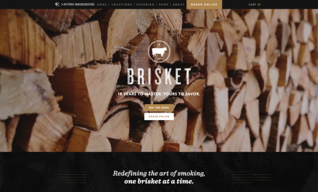
The hero image
The image you use in your header should be part of telling your story and show the win that your client is going to experience by working with you. Stay away from corny, impersonal stock photography here.
I hate to break it to you, but visitors may not be all that interested in seeing your staff, or pictures of your building, or other stuff like that if it doesn’t help tell your story and the results they can experience by working with you.
This isn’t the place where you talk about you. This is where you answer the visitor’s question: “what’s in it for me?”
One big thing to keep in mind here is how this image is going to work when you overlay text on top of it. You don’t want text on top of busy parts of the image. You also don’t want awkward positioning of the image’s subject in relation to text either. An example would be text that covers the face of a person in the image.
And since we’re on the subject of the header image, please don’t use sliders or automatic image carousels. Peep Laja from ConversionXL points out that they’re not effective, distracting, and users tend to skip over them. This is one of those features that sometimes look cool, but don’t really deliver results.
The headline
Your main headline needs to communicate clearly what problems you solve. Don’t be clever, or try to be witty here. Communicate clearly. Tell your visitor exactly what they get and what benefit they’ll receive by working with you.
The subheadline
Your subheadline is your opportunity to succinctly elaborate in a couple short sentences your solution is delivering. Think of this as a subtitle for a book. This is short, succinct, and gives a little more context.
The call to action
You should be able to clearly see and know what your main call to action is. Sometimes we get cute and try to make fancy buttons. There isn’t anything wrong with fancy buttons so long as they stand out clearly and are prominently featured on the page.
Design considerations
Make sure your fonts work well with your image. The placement and font family you choose to use for your headlines in this section should really work well together. Usually, a sans-serif font along with a great serif font can make for a stunning visual presentation.
Jeremiah Shoaf and typewolf.com is a great resource that I’ve learned a lot from about font pairings and I highly recommend checking out his site and resources.
Visual cues
You’ve probably heard the debate if you’ve spent any time thinking about your homepage:
What goes above the fold? What if a user doesn’t scroll? How do we get people to see what’s below the fold?
First of all, there is no “fold.” And to alleviate your fears and concerns, everyone scrolls according to a study done by Huge, a design firm who has worked with some of the world’s biggest brands.
A great way to encourage visitors to dig deeper is to include in your header section a visual cue that there is more to the page than what just loads in the browser frame.
An effective cue is a nicely designed arrow pointing toward additional content. It’s a nice feature to use, especially when you delay loading it for a second or two. The appearance of the cue is a nice visual reminder that there is more to explore.
Another effective cue could be a section displayed just inside the bottom of the browser showing more text to read. I’ve used several different options to encourage visitors to explore down the page by scrolling and there are several good ways to do it.
Here’s the deal:
Whatever cues you choose to encourage your visitors to engage it should be simple, and elegant, and not overly intrusive. We’ve all seen those ridiculous flashing ads on some sites that are visually screaming for attention. That’s what you want to avoid (and a key reason why ad blockers are a necessary browser tool these days, but that’s a subject for a different post).
Overall, for your header section, less is more here. Too many things going on will distract and take focus away from helping your visitors learn what’s in it for them when they visit your site.
The Intro Section
Visitors to your site want to know you and what it is that you can help them with, so taking the next step in telling your story is to tell them about how you deliver value through the products and services you offer.
This is where you can display a short, succinct, value-laden elevator speech for your homepage. This should be roughly 3-4 sentences of dripping with value that your target audience will resonate with.
A great formula for this would be to build a statement using the S.I.R. framework by Richard Fouts:
S – Situation: Communicate how you understand the conflict or pain that your customers face.
I – Impact: Illustrate how that situation impacts your customers and the effects it has on their lives.
R – Resolution: Explain how you remedy these situations with the benefits and advantages your business delivers.
The focus of this section is your value statement, so this isn’t a place where a lot of elements are needed. A section title, a short paragraph, and a call to action button inviting them to learn more is the most you need to have here.
The Process Section
Sometimes, it’s hard for your visitors to understand what you do, and what it’s like to business with you so creating a simple process map can go a long way to illustrating how easy it is to work with you.
People rarely, if ever, buy when they’re scared or confused so the point of creating this process section is to alleviate their fears and objections by laying out your process and walking them through the plan.

Remember, our goal is to engage visitors so we’re going to help them by showing them how easy the process is. Then for those who still want to dig deeper, you can link up your FAQ page here.
Once they’ve seen how easy it is and you’ve laid out the process and plan for them, don’t just leave them hanging there, give them a strong call to action and get them clicking through!
“How We Help” Section For The Best Homepage Web Design
This section relates closely to the intro section above, but there are a couple key differences.
This is where you provide more detail to your site visitor referencing the specifics of how your products and services address the pain problems they have and how you deliver solutions.
This section works well when your services can be clearly defined into three of four distinct different categories. A common feature on well-design homepages is icons that represent each of the different service areas with a short, concise, description of the category and a call to action to learn more.
Pro tip: One of the things to keep in mind here when using icons is how you construct your copy. Your copy’s word count and character length should be pretty uniform across all the categories you display here.
Validation & Social Proof Section On a Well-Designed Homepage
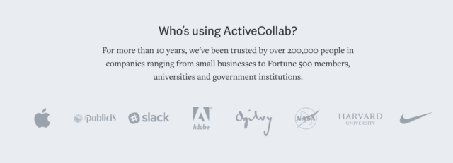
If you want to establish credibility and gain trust from your target audience then your homepage has to have a social proof section. According to Entrepreneur Magazine, social proof is a huge benefit to building connections with your audience, so you will want to show some social validation on your site.
It’s no secret that people will look around to the experiences others have had before making a decision as to whether or not they should purchase a product or service. Adding in testimonials from your clients adds a level of credibility to your business and is an essential part of any homepage design.
So what’s the bottom line?
Social proof shows your site visitors and potential customers the results others have had when using your products or services and that that the solutions you offer work and that those same solutions can work for the site visitor too.
In addition to testimonials, depending on the type of business you’re in it can be a good idea to show logos from known brands that you’ve worked with. These logos tell prospective customers that your business is worthy of trust by those brands, and your products or services can be a great solution for them too.
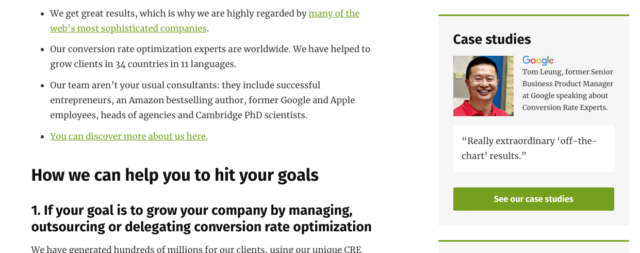
Since we’re talking about building connections and helping our potential customers to know us, trust us, and like us, another great tool to build credibility is to use case studies in this validation section.
Case studies spell out in greater detail the specifics of how you helped a customer go from where they were to the success that they now enjoy having worked with your business. It’s a way to demonstrate proof of concept and your ability to deliver results.
Conversion Rate Experts are a great example of a business who leverages great case studies on their homepage to demonstrate credibility, authority and the ability to deliver results.
How to Design a Website Homepage Resources Section
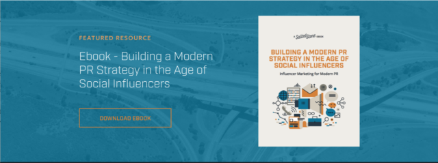
The last section we’re going to talk about is a resources section. This section is where you provide a free resource for those that are testing the fences and trying to decide whether or not you can help them.
If you can help them with something that relates to their current struggles through a free downloadable guide, email course, or white paper it opens the door to being able to communicate with your ideal customers and site visitors.
Want to know the best part?
This is a fantastic opportunity for your visitor to download value-rich resources you have created. It can, and should be, the beginning of a relationship that you can cultivate and nurture via email where you can continue to build the relationship and deliver value. When your visitors give you their email address in exchange for a free resource they’re opening the opportunity to continue the conversation with you about how you can help them.
By presenting a great opt-in opportunity for something valuable to your target audience will help you build your relationship with an ever-growing audience and deliver value while helping you build your sales funnel.
What “Section” Means
By now you’re probably thinking about how all this fits together so here are a couple thoughts.
The most important part of your homepage design is whether or not it effectively serves your target market.
So each of the sections mentioned here could be small or large. How the page is laid out, and in what order you place these sections is based on your priorities, your target market, and your design approach. No doubt, you’ll have more than a couple revisions as you work to get things just right for your homepage design.
A lot of times the best way to begin the discussion regarding your layout is to sketch out some ideas on paper. No need for fancy tools unless you’re really quick with getting the concept added there. Getting the idea captured is vastly more important than the tool you use to capture it, so don’t waste time getting bogged down in choosing a tool to use.
Use a pen and paper to sketch out initial ideas and concepts with your designer. Figure out how and where you’re going to add each section. Figure out what visuals you want to accompany them.
Don’t be afraid to change to change things and move stuff around. But you also don’t want to get caught in the paralysis of analysis.
Get the right people involved in the discussion. That doesn’t mean everyone. Too many opinions can derail you from your objective.
Finally…
Making sure that your homepage loads fast is a prerequisite for every homepage design. If your home page doesn’t load in under 2 seconds you’re too slow. Don’t run the risk of people bouncing off your site because the site took too long to load.
Conclusion
Building your best homepage ever is attainable for anyone. It’s a thoughtful, strategic process that takes time and effort if you want to see real results.
To summarize:
Define your priorities to establish a clear path for what success looks like for your homepage.
Get really clear on who your ideal customer is. You’ll have a clear picture of who your target market is, who it is that you want to interact with your site, what their problems are, and where they’re struggling so that you can communicate with them clearly in a language they understand.
Craft your content for maximum clarity. Don’t worry about being clever.
Use solid design principles that communicate effectively and look great.
Be thoughtful and plan out each section carefully to deliver maximum impact and to represent your business well.
Here’s the best part:
You don’t have to be a huge company with a big team to build an awesome homepage! If you carefully think through what you’re trying to accomplish and who your target audience is you can build a homepage that you will be proud of, that will perform well for you, and represent your business well.
The one thing true about virtually all websites is that they’re never really done. It’s a process of continuous refinement and growth. They evolve over time as markets change, but always be prepared to give a reason for any change you want to make. Understand why the changes and updates you incorporate in to your homepage make a difference in the overall performance of the page so can track progress over time. It’s worth the time and effort to do it right.
Question:
What’s your favorite example of a great homepage?