What if I told you that the images you’re using on your website are killing your results?
What if I told you that you are losing business, leaking conversion opportunities, and turning off your ideal customers with the images you’re using on your site?
Would that get your attention?
I bet it would.
Because I know it did for me.
Some things just have to be learned through repetition and experimentation.
And that’s what I’ve been doing for years and years when it comes to web design and how to use images to build great pages.
I’ve been working on a new website project for a client and when it came to talking about how we were going to gather images for their website they were eager and willing to get us whatever we wanted, and fast.
Like, too fast.
And too eager.
Something didn’t seem quite right, but I knew we’d get it figured out.
You see, early on in the web development process I like to get everything on the table and cover all the responsibilities each party has – me and my team as the designers and developers, and in this case, the client as the ones who would generate their content, including gathering the images they want to use on their new site project.
Everyone was clear about what the needs were, and so we were off to the races to meet the timeline and milestone dates and get this project done.
Until we received the first batch of images they sent.
While their efforts were noble and they’ve been the ideal client in so many ways, they clearly didn’t get what we were talking about regarding the images we’d need from them.
The images that they sent were not the kinds of images we needed for their new website project.
So what did we teach them to help them get great images for their website?
Keep reading…
Use images that focus on your target audience
It makes sense that you have a favorite image that you might want to use on a page. But that doesn’t mean that your target audience is going to resonate with that image.
Your website visitors are going to be motivated and make decisions based on emotions and how your content makes them feel.

As you’re telling your story on your site those emotions may be frustration, fear, anticipation, desire, and excitement, so you want the images you use to match up with the emotion your trying to evoke.
The subject of the image should match up with the copy on the page and the story you’re trying to tell.
Use images that have good compositional balance
You don’t want to confuse your visitors by just throwing text on an image, or because there is not enough contrast, or the text on top of the image is hard to read.
Or the image is too busy.
Or the text is covering a person’s face.
Or the subject in the image doesn’t match up well with the text placement.
I’ve seen all these mistakes happen on real websites.
And definitely, do not use Photoshop (or whatever other image processing app you use) to add text to an image.
That’s a huge mistake.
That text isn’t indexable by search engines and people who use assistive devices like screen readers can’t read it.
It just looks bad and won’t scale properly.
This means that if you’re using the image for a background on a page section that it fits the overall layout of the page. Sometimes you get a really good image, but it doesn’t fit with the page.
Here’s an example.
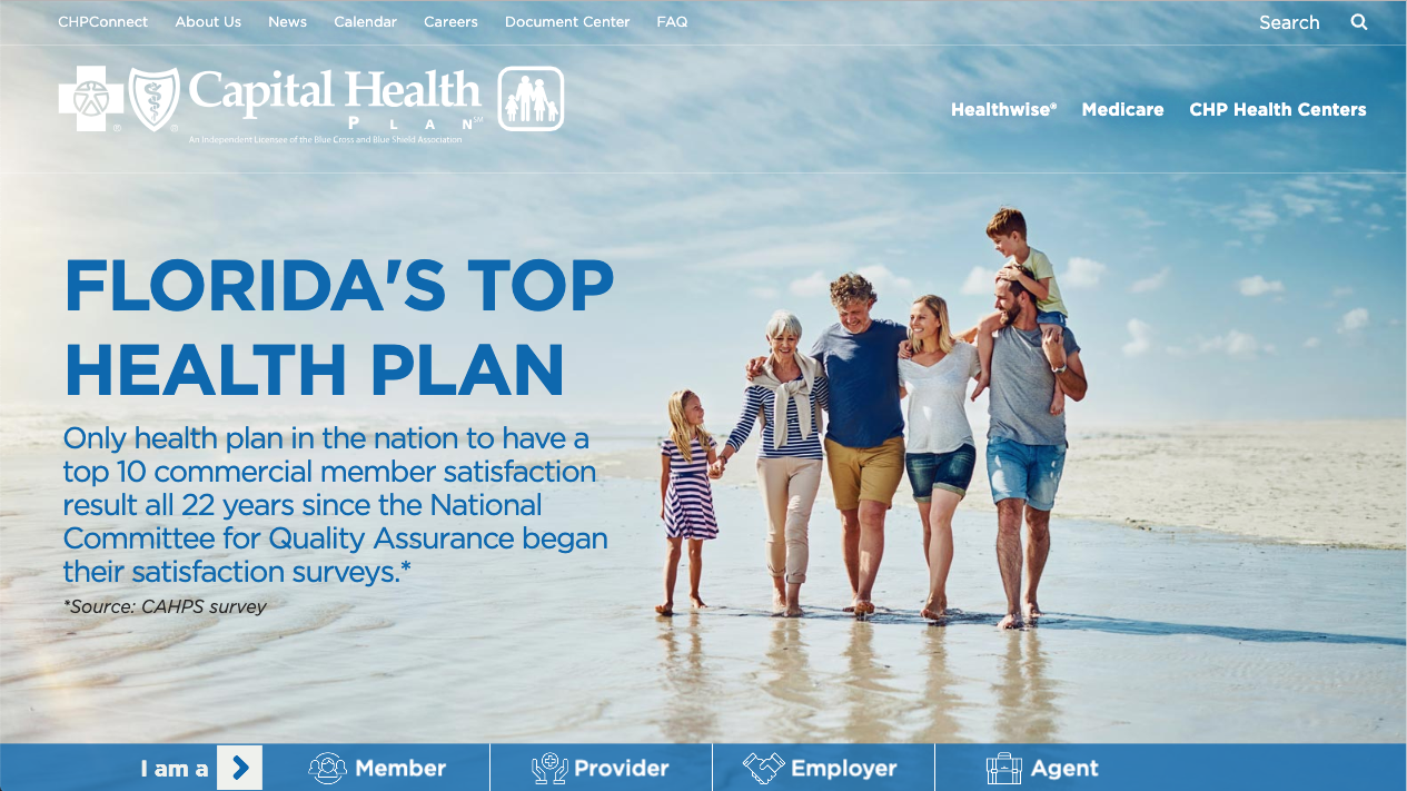
The image used for the background here has a consistent color from left to right, with plenty of space to place the text on the left.
The color of the image also fits with the text that overlays the image, providing sufficient contrast between the light background and dark text color.
Use images that are framed up correctly
This is a problem that I see mostly with images provided by clients who are snapping images themselves for use on their website.
What happens is that the subject of the image ends up being so small in the image that it’s virtually impossible to properly crop out all the extra space and get the image at the right size and orientation.
Another big problem I see is too much headroom above the subject in the image.
The image ends up centered in on the person’s face and there is 50% of the image above the person’s head.
If you look at high-quality images with people as the subject as well as professionally done headshots you’ll notice that the space above the person’s head is minimized:

Same thing goes for other subjects too. Too much extra space above or around the subject of the image makes it difficult for use on your website.
Another thing that happens when grabbing shots of locations is that part of the subject of the image is cut off on one side. This is especially problematic if you’re going to knock out the background of your image.
Use professional images when you can
Here is the gospel truth:
The best option is to hire a photographer to do a shoot for you.
That way, you get really high-quality images that are specific to your business that you can use in a variety of ways.
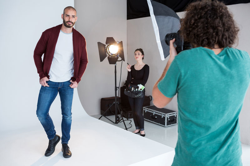
Images that are unique to you and your business, that are professionally done and represent your business well are so much better than using stock.
It’s not always an option if your budget doesn’t all for it, but using a pro will make the images you use for your website and marketing purposes so much more effective.
If you can’t hire a pro then let me caution you to…
Stay away from smartphone images unless you really know how to capture great shots
Smartphone cameras are amazing. The camera that’s on the latest iPhone is light years ahead of some of the digital cameras I’ve used in the past.
But that doesn’t always mean that it’s the right tool for the job.
If you’re great at grabbing high-quality images (and not just selfies for Instagram) your smartphone can be a great tool.

However, if you’re not a great photographer, running out and snapping some shots at your job site to use on your website may not be the best idea when it comes to getting good photography for your site.
Stay away from cheesy stock images
Cheesy stock photos are just that — cheesy. Everyone has access to stock image libraries these days and there is a lot of really bad stock photos in use.
Example:

Instead of using a stuffy, corny, cheesy wannabe-corporate stock image, find something that’s high-quality. That means no shaking hands, corny smiles, or suits.
Next Steps
So, does that make sense?
Getting your high-quality images for use on your website is a lot of work, but it’s worth the time and effort.
And it’s always a good idea to have a guide, or a checklist to make sure you’re not missing any of the vital steps. That’s why I created the Ultimate WordPress Start-Up Guide.
I built this guide so that you would have all the things you need to start a new website project with WordPress right at your fingertips.
This guide will allow lead you down a path that covers it all in an easy-to-understand way so that your new website is a success from day one.
Make sure you don’t miss any of the crucial steps in getting your new website project online by following the steps in this guide.